CASE STUDY: A
Solvar Re-branding
The History of Ireland collection contains a range of jewellery displaying twelve symbols depicting twelve iconic chapters in Ireland’s rich past.
The brief was to shoot a collection of imagery to accompany each symbol.
My vision was to attempt to tell each story using a single image coupled with its symbol. Reducing the amount of information needed on advertising so as not to overload customers.
ANALYSIS
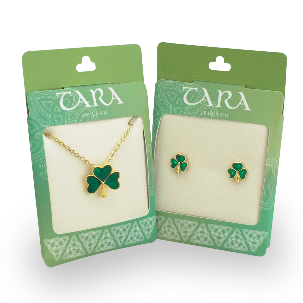
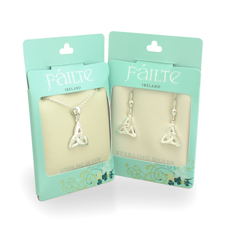
At the time of this project the packaging & stationary had been previously outsourced to two separate media companies at different times with no collaboration or brief sent with them.
Previous designs had diluted the visual presence of the brand and had often caused confusion among customers as to whether certain product belonged to the brand or not.
They had 3 packaging styles on the shelf with no unity or common visual qualities to them, with only one style clearly displaying the brand.
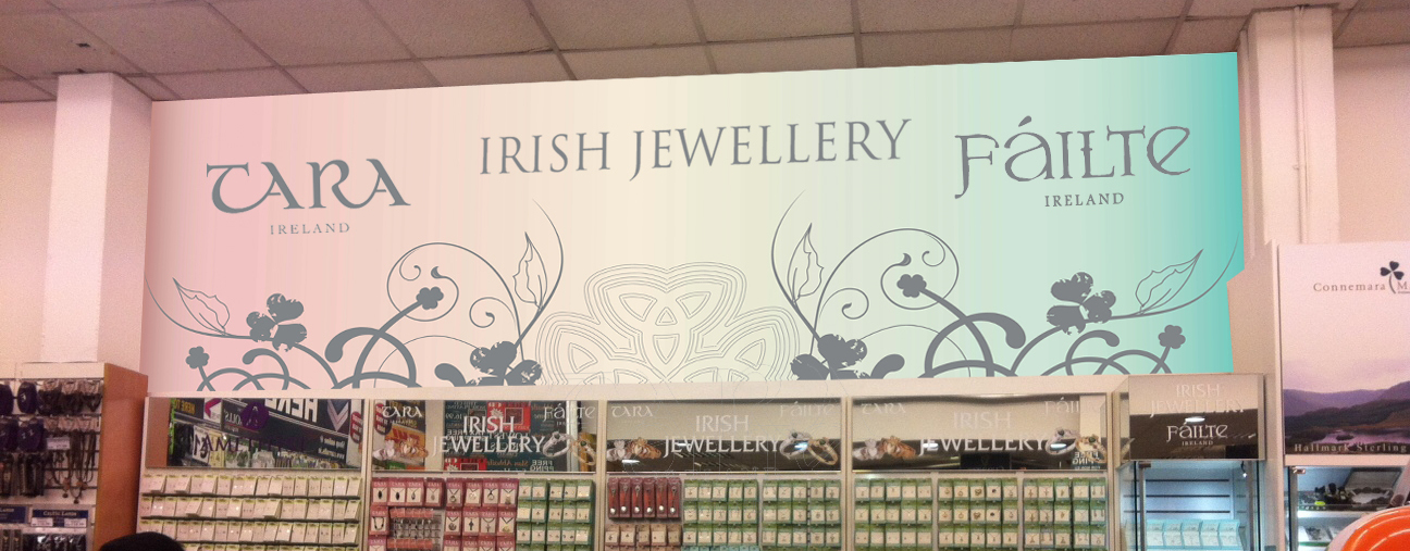
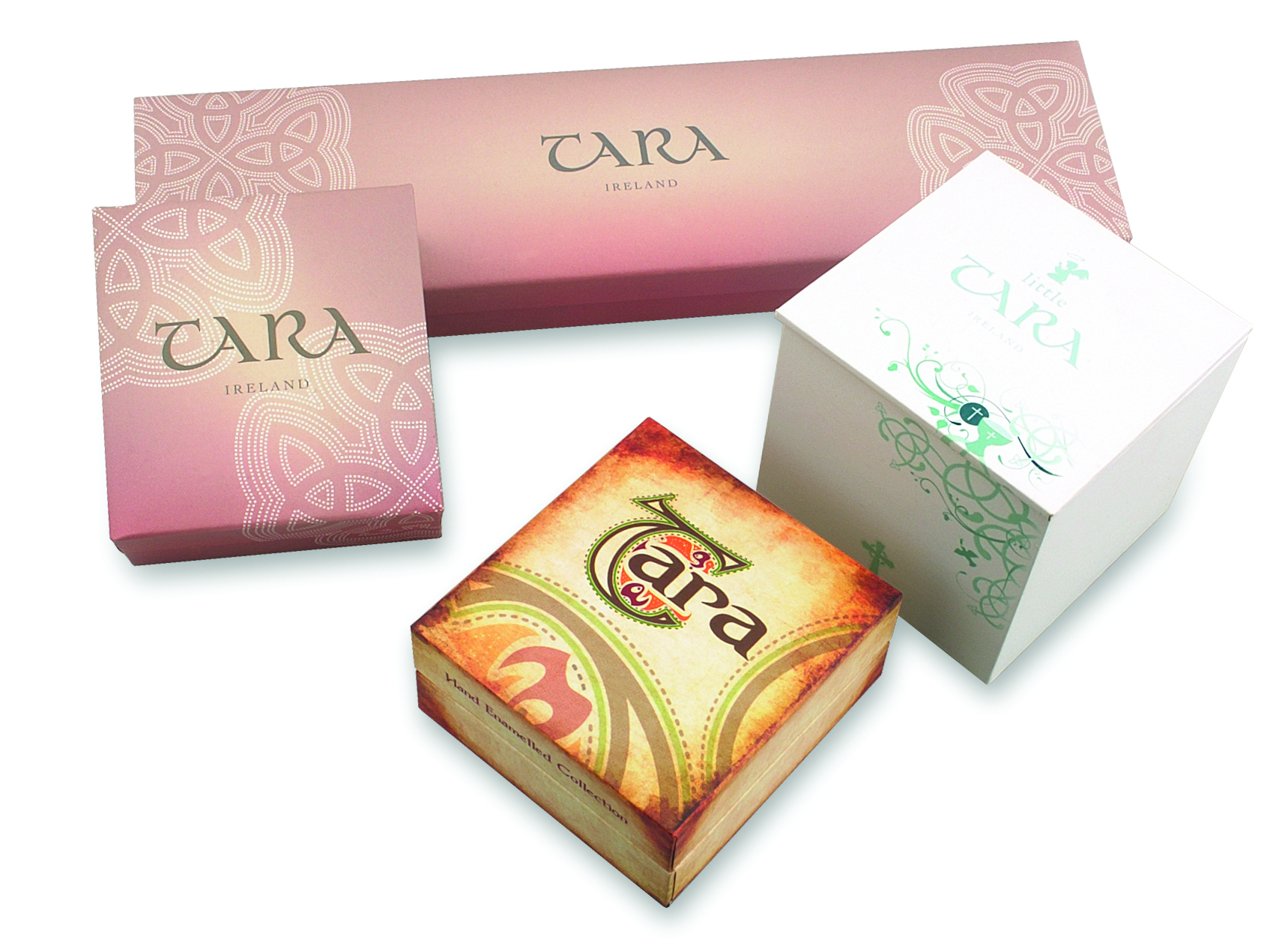
- There was no cohesion between the separate branding. The colours chosen didn’t work well together and there was no vision or clear strategy.
- Customers were unsure what the separation in branding meant. It caused confusion and some customers inquired about competitor’s product due to a likeness in branding.
- After initial printing, there was added costs in re-printing 3 separate styles of packaging, which in turn, resulted in much waste.
SOLUTIONS
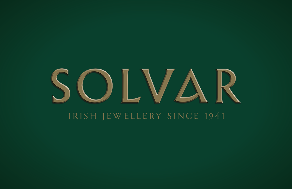
Solvar had been selling Irish Jewellery for almost eight decades and this heritage had not been represented anywhere in their branding. The new branding is much cleaner, and utilises an elegant script for the tag line.
I wanted to keep it simple, to stick to recent trends and simplify the design. Stripping away any unnecessary details and cluttered decoration. Revamp it so it transcends better across emerging digital channels, whilst still holding onto its historical foundation.
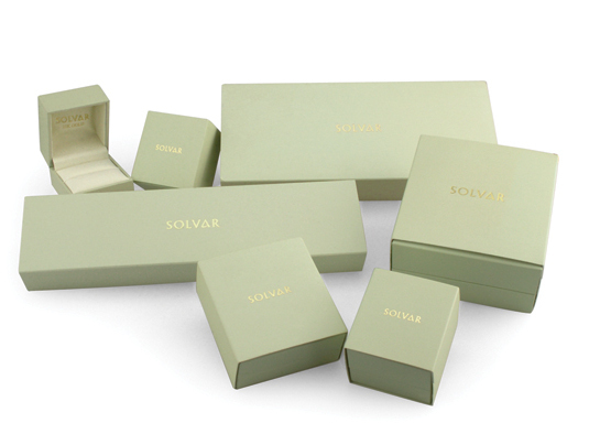
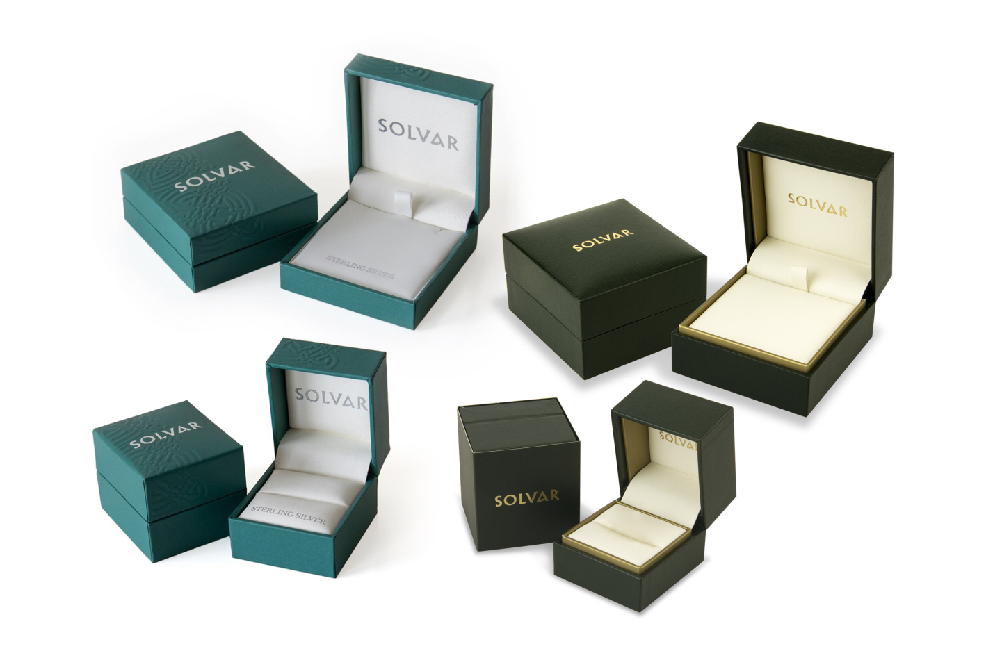
The packaging needed symmetry. Enough to know this was all the product of one company, but still maintaining a discernible difference between each price point.
Identity
Keeping the same logo typography, it remains recognisable and still speaks to a mass audience.
The tagline “Irish Jewellery since 1941” signifies the heritage, years of experience and evokes a certain heraldic nostalgia.
Corporate
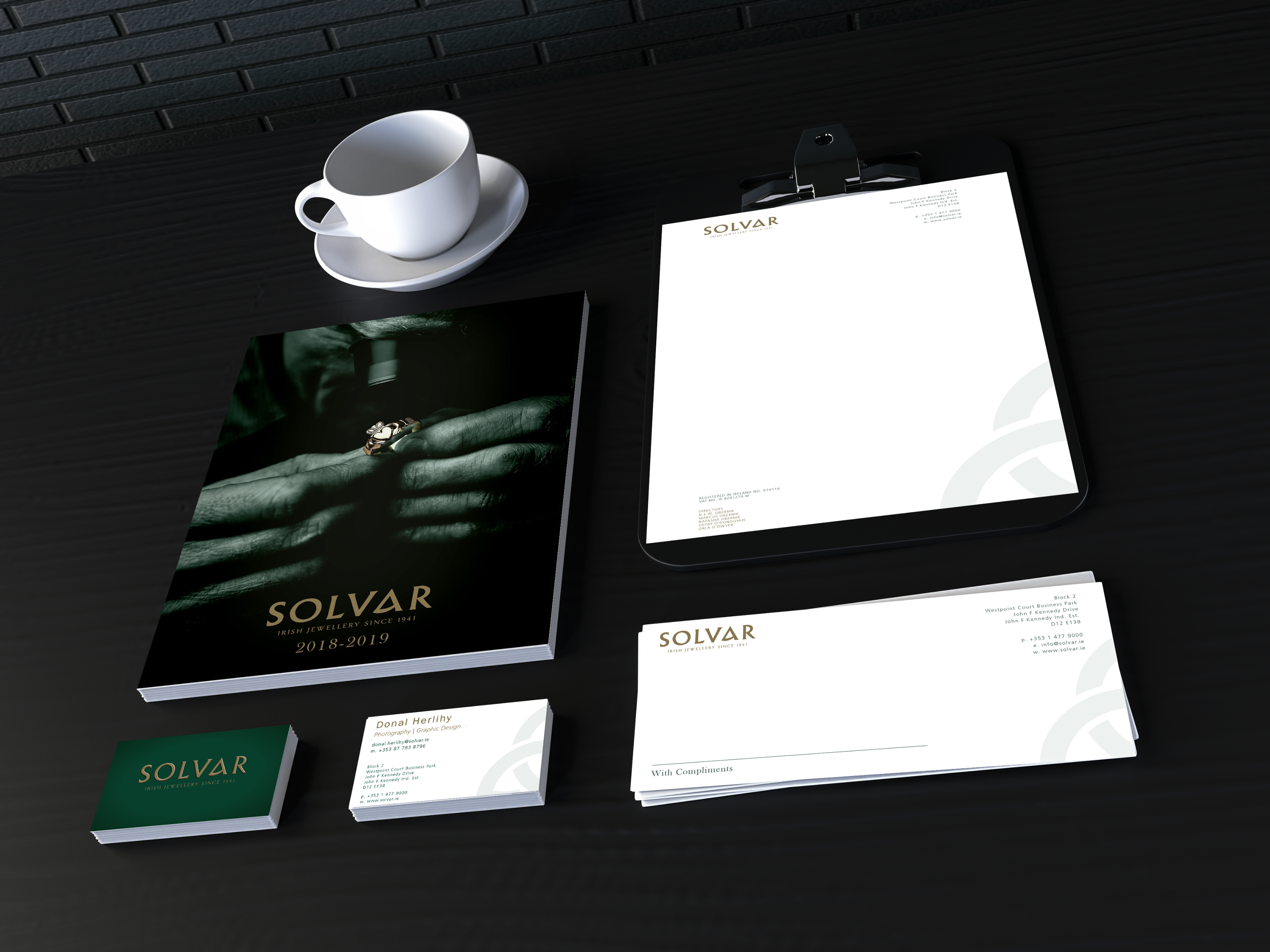
For the stationary I added a subtle Trinity Knot to the artwork. A simple Celtic symbol representing a never-ending unity throughout the brand.
It adds depth & texture to the business card. And although the changes here are subtle, they’re distinctive and help improve the quality of the overall stationary aesthetic.
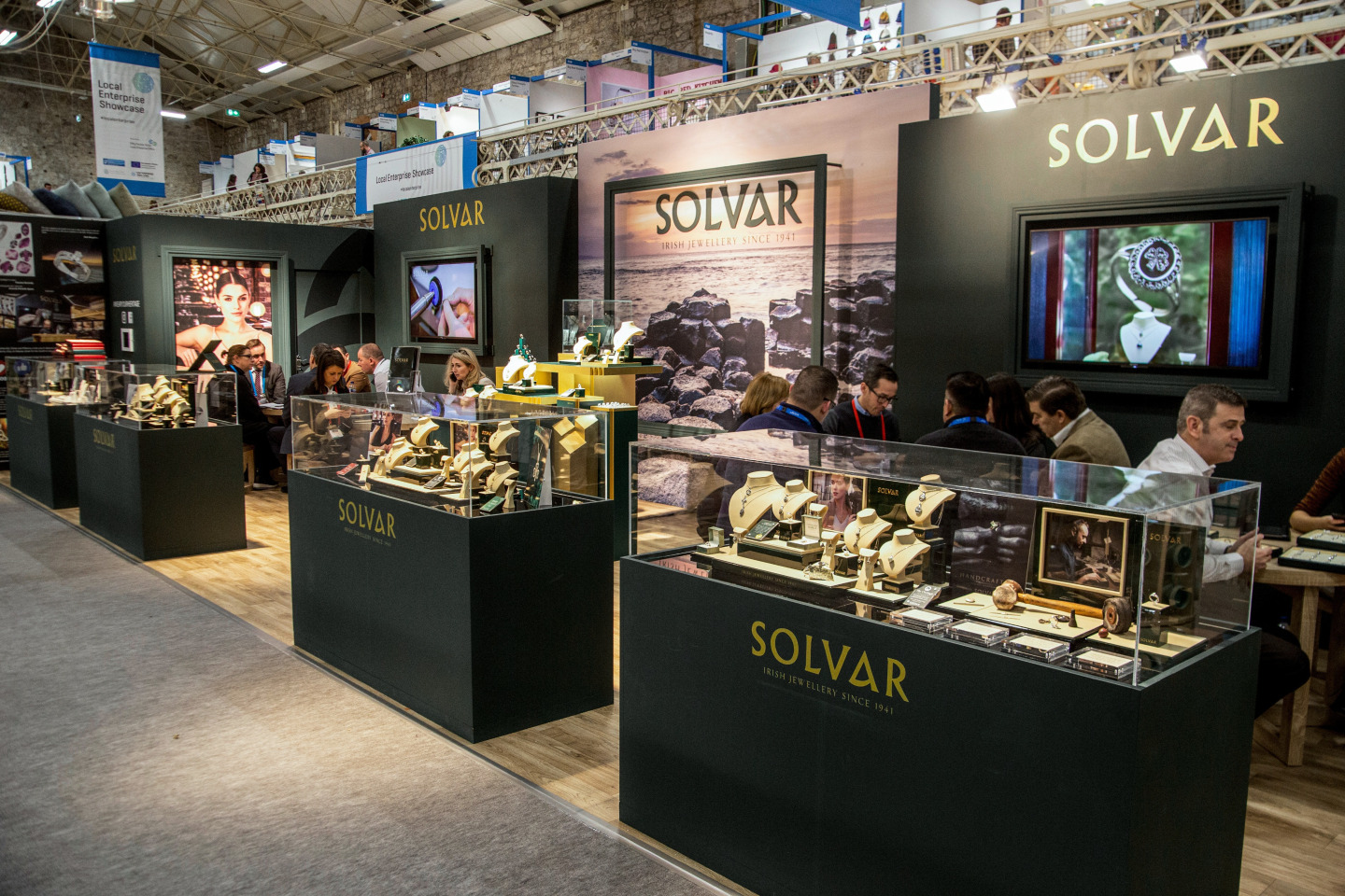
Visual Display
I dialed the green back much darker. A colour connection to Irish Heritage, without it looking too “Touristy”.
It is a much more elegant, vintage colour now, yet the strength of the green under golden highlights still retains plenty of grandeur for a luxury brand.
Advertising
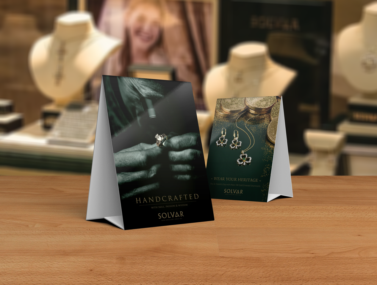
I chose to bring the core essence of the brand to the forefront – Handcrafted.
The Goldsmith Image was widely used during this campaign and helped portray the craftsmanship involved.
I tried to maintain this green throughout different seasonal advertising campaigns.
Packaging
Across the other packaging styles, I incorporated different shades of green to keep them distinguishable, yet now we had a sense of commonality running throughout the suite.
Marketing the more affordable and younger-steered Jewellery much more playful.